In the assignment for this week, we are to select a site that falls under the definition of the “History Web” critique it. We are to examine it – to see how it works and how it doesn’t. We are also asked to think of it in terms of the “History Web,” Public History, and the Digital Humanities.
So… I had a lot of fun with this assignment. I had so much fun in fact, that my response to the prompt will be spread out over more than one post. So buckle up, although I am starting with one post, there will at least be one more following it up.
BBC School’s Primary History
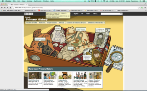
The site I chose is the BBC School’s “Primary History” website. Standing for British Broadcasting Corporation, the channel is very similar to America’s PBS – Public Broadcasting Service – and offers television, radio, and online programming to the public. Much of the content is educational and strives to be impartial.
Now, onto the site itself. This site is GREAT. There are a lot of things I could talk about but to do that… you might be reading a paper instead of a blog post. So today, I will explore two aspects of the site: the importance of audience in the layout, format, and content of the website, and a related digital feature, interactivity. While discussing these topics, I will reference the Cohen and Rosenzweig’s Digital History text assigned for this week.
My first topic, audience, is something that as a public historian, I love to talk about. It is also something that this site excels at understanding. Geared towards students, teachers, and even parents, the core of the site’s content is to be used for educational purposes. Subjects are historical but related fields include literature, music, and archaeology (which further expands potential audience). The BBC’s choice of layout reinforces these priorities as the topics are prominently featured in the tool bar near the top of the page. They are also visually introduced through the use of fun graphics and cartoon imagery in the center of the page.
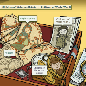
Snapshot of the “treasure drawer” which lays out, visually and textually, the main themes of the site.
This also gets to another point – something that Cohen and Rosenzweig really hit home with – a thoroughly integrated site is one that doesn’t just pair words and images together but harmonizes them.
Because of the illustrated nature of the homepage, and as you click through the site, it’s subsequent pages – the site intentionally appeals to young audiences with it’s comic-strip style and eye-catching (but I will add, not overwhelming) palette. An added surpise are the colors that animate the artifacts as you pull your mouse over the objects and text bubbles concentrated in the drawer.
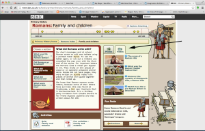
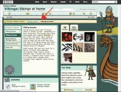
Upon clicking one of the subjects – for instance, Vikings – it takes me into the Vikings index page. Before I go on though, here is what I am talking about:
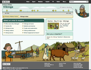
Seen with this screenshot are the different activities for students and the portal for teaching resources
By entering into subject portals such as this, viewers are able to access numerous materials, much of them interactive. Kids can find games (where they can even tailor the visual experience through choosing layout and alignment preferences), photos, and videos. They can also learn about more specific aspects of Viking society. Want to learn about the roles of men and women? You can click to learn more.
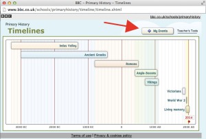
One of my hands down, favorite parts of the site is the timeline feature. Placed under the title is a timeline that highlights significant dates, such as the first Viking Raid on England (787) and the Vikings landing in America (1001). Following the “Explore Timeline” link above that, you go to an additional timeline that places the Viking age in relation to other world cultures.
Do you think the Anglo-Saxons knew of the Vikings?
Taking it to a new level of interactive and referencing Shared Authority, you can even create your own event by clicking on the “My Events” button. I didn’t add one yet, but I most likely will my next visit to the site.
Appealing to teachers and adults in general, the site expands its audience.
However, this site does not purely attract students and kids as the well placed text for teachers attests. There are links for teaching resources and instructional aids on nearly every page you are directed to.
Contrary to Cohen and Rosenzweig, who caution against using shades of the same color or tonally similar colors, I would argue this approach actually works for the site – especially when thinking about the audience and the abundance of information presented.
The digital historians do have a point when referencing the use of bright colors. Something to remember about this site is that it is busy. There is a good deal going on (visually and textually) already so to add lots of bright and/or contrasting colors would be entirely too much for some visitors.
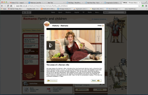
While I am addressing this topic, other aspects of the design – primarily the dual columns of text and the strategic uses of text boxes to delineate related content were also helpful for me as a viewer. The text boxes set up a topic for which all items inside related. Take this closeup of a text box concentrating on Vikings homes.
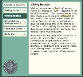
By clicking on the different units, learners read about different parts of viking culture and daily life. Placing your mouse on the highlighted words provides further information for website visitors.
The method of presenting information – relating it visually but breaking it into units – is helpful for both students who need knowledge broken down and instructors who have to make sure that subject units are manageable for students to understand.
Clicking on the link for teachers resources, it is now obvious that this is the other intended audience. Traditional worksheets are offered as are online and classroom games, videos, pictures (of 2-dimensional and 3-dimensional depending on the objects being discussed), sound bites, and external links. These pages essentially function as online syllabi. It is also easy to direct yourself from these teaching aids back to the more kid-friendly components.
One other great thing about this website is that the designers use every inch of the screen – they don’t waste space.
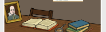
Although not the real desk… the image keeps the viewer engaged.
No matter what page you are on, they activate space and make it relate to the page’s text. The picture at right is the foot of the background for all pages relating to the topic of William Shakespeare.
Navigation is something I want to briefly mention here. A website, if anything, should navigable. Regardless of how much information it holds, if the visitor can’t move between pages, then as Cohen and Rosenzweig explain, they won’t stay very long. Using the snapshot below as an example, we can see the path I took as a visitor to get to the present page. This usability is a real strength of the site.
The path I took to visit my Viking neighbors.
If visitors want to learn more, additional links provide pathways to supplemental information. Below are two examples of external links to Viking history websites outside of the BBC (the site lists internal BBC links as well). The first is more theatrical while the second, more academic:
-

Anyone care to see a show?
-

Just as informative, but not as many outfits.
So… with all this excitement you might wonder, are there any drawbacks?
Yes, and unfortunately it could be a big one. For being a site that anticipates potential viewers, there are not many spaces for user feedback. After spending time with the website (way too much time probably), I could not find comment sections or other spaces for visitors to respond with their ideas, opinions, or compliments. Considering how impressive other aspects of the site are, this strikes me as a little strange; as a site that is not just a history site, but one whose purpose is so obviously connected to educating the public, there is no space for the audience to leave their impressions. This is where the sites interactivity falls frustratingly short.
In addition, much of the content created for the site is simple… perhaps too simple. For one of the “Fun Facts” on an information page, viewers read: “Foreign visitors were impressed by Benin’s police. They kept the city peaceful.” This statement glazes over a lot of information. Even though this is a site constructed for children, more information could have added complexity to this misleading vision of law & order.
This leads to a third criticism. The information presented is quite specific – students are given choices in activities and games – but much of the questions and content correspond to set narratives. At the conclusions of the games, connections are drawn for the players. What I am saying is, not a lot of space is created for students to draw their own connections. I wonder if this is related to their ages. As students in the younger to medium grades, they are either just learning about these skills or have not had the ability to practice them. Either way, this site could benefit from providing more opportunities to flex these growing scholarly muscles – particularly for those students using the site independently. When learning with others, this potential can be realized through personal interaction and instructor or peer support.
Acknowledging where it comes short, this is still a really good site. It is, as Cohen and Rosenzweig would define it, it is of the “history web.” It also is a public history site, and a website rooted in the Digital Humanities. Most important of all, there is something for everyone – regardless of your age.